As part of our countdown to the new year, here are Heritage’s top five must-see charts of 2013.
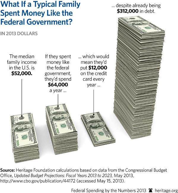
5. What If a Typical Family Spent Money Like the Federal Government?
While middle-class families are still plagued by a sluggish recovery in the Obama economy, this is what their finances would look like if they spent money like the government—and it’s not a pretty picture. Most families understand that it is unwise to constantly spend excessive amounts compared to what they take in, but the government continues its shopping spree on the taxpayer credit card with seemingly no regard to the stack of bills that has already piled up.
4. Obamacare’s Barrage of Tax Hikes
Remember President Obama’s promise that he would not raise taxes on the middle class? Much like his pledge that Americans could keep their health insurance, this turned out to be another promise Obamacare was bound to break. As this chart shows, tax hikes included in Obamacare are huge and pervasive, amounting to hundreds of billions of dollars in new revenues. Since this chart was published, new numbers for Obamacare’s taxes have become available, and a study by Heritage’s Alyene Senger shows that Obamacare will impose even more in taxes—amounting to a whopping $771 billion in new revenue through 2022.

[…]
![]()
![]()
![]()
![]()